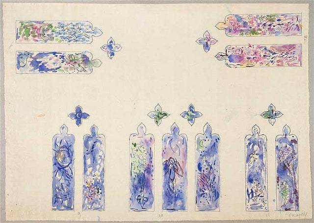
These are so free! What a lovely way to design for stain glass.
These watercolors look as if they are right at the beginning of the design stage. I also love the way they are at right angles to each other, suggesting the placement of the windows in situ.
Working to scale, the designs are exploring colors, what to put in the windows, and the balance – how they all work together.
They’re delicately beautiful, don’t you think?
Perhaps next time you’re designing a panel you could try with watercolours first. They’re very expressive and quite glassy too. Most of all when done in this sketchy way, they might free you up and some design ideas might pop out of nowhere! Or develop slowly…
There’s a wiki website of Marc Chagall stained glass here if you’d like to see what Chagall’s completed work is like.
